
Materials
GIS’s ArcMap 10.1 software was used for most of the research conducted; Google and other search engines were also used. Once the data was refined, Excel was used to determine correlation.
Methods
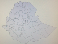
The majority of this project was done on the computer. Research was conducted using search engines such as Google to find raw data on malaria and sickle cell cases. The beginning focus was malaria cases world-wide but was then narrowed down significantly as it was discovered that some places have much more diverse and detailed data than others. Eventually Ethiopia was selected for its vast variation of ecosystems and malaria cases between regions and the dramatic shift in the number of cases from year to year. This was also done for sickle cell anemia using the same methods and regions. Once the raw data was found, arcMap was used to map the data but the regions in the data did not match up with the specific regions that were in Ethiopia. The given regions had to match up with the map. This meant taking 567 original regions on arcMap and combining them into 87 regions that matched the research.
Once the maps were the same, the raw data was inserted into the data tables on arcMap software. Mapping the data correctly and inserting the numbers in the proper order is extremely important. This showed the differences between malaria cases in 87 regions in Ethiopia over a five year period from 2004-2009. The software was used to color code the different regions depending on how many cases of malaria there were in that region. This process was repeated for each year in the data set and then the different maps were compared.
Once this was completed for malaria, the process was repeated for sickle cell anemia. Then a comparison of the differences and similarities between sickle cell anemia and malaria was done. Research about the ecosystems was conducted next. Specific data about temperature, rainfall, water ways, elevation, tree cover, herbal cover, wetlands, malaria’s relation to temperature, and ecoregions was found. All of this specific data had to be mapped. Once the data was mapped it was compared to the malaria map to find trends and similarities between the maps to see if anything correlated. This was done by putting the data from the maps into Excel and graphing it. Once it was graphed, the trend line was calculated and the R2 value was analyzed. An ANOVA test was also done to analyze the ecoregions. The water ways and Digital Elevation Model were analyzed visually.
GIS’s ArcMap 10.1 software was used for most of the research conducted; Google and other search engines were also used. Once the data was refined, Excel was used to determine correlation.
Methods
The majority of this project was done on the computer. Research was conducted using search engines such as Google to find raw data on malaria and sickle cell cases. The beginning focus was malaria cases world-wide but was then narrowed down significantly as it was discovered that some places have much more diverse and detailed data than others. Eventually Ethiopia was selected for its vast variation of ecosystems and malaria cases between regions and the dramatic shift in the number of cases from year to year. This was also done for sickle cell anemia using the same methods and regions. Once the raw data was found, arcMap was used to map the data but the regions in the data did not match up with the specific regions that were in Ethiopia. The given regions had to match up with the map. This meant taking 567 original regions on arcMap and combining them into 87 regions that matched the research.
Once the maps were the same, the raw data was inserted into the data tables on arcMap software. Mapping the data correctly and inserting the numbers in the proper order is extremely important. This showed the differences between malaria cases in 87 regions in Ethiopia over a five year period from 2004-2009. The software was used to color code the different regions depending on how many cases of malaria there were in that region. This process was repeated for each year in the data set and then the different maps were compared.
Once this was completed for malaria, the process was repeated for sickle cell anemia. Then a comparison of the differences and similarities between sickle cell anemia and malaria was done. Research about the ecosystems was conducted next. Specific data about temperature, rainfall, water ways, elevation, tree cover, herbal cover, wetlands, malaria’s relation to temperature, and ecoregions was found. All of this specific data had to be mapped. Once the data was mapped it was compared to the malaria map to find trends and similarities between the maps to see if anything correlated. This was done by putting the data from the maps into Excel and graphing it. Once it was graphed, the trend line was calculated and the R2 value was analyzed. An ANOVA test was also done to analyze the ecoregions. The water ways and Digital Elevation Model were analyzed visually.
